
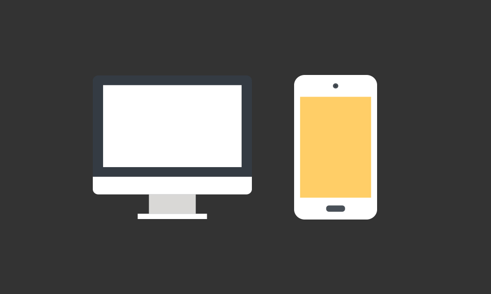
PCとスマホで画像を切り替えたい時、メディアクエリを使用して切り替えるのが簡単だし一般的ですが、少しでもサイトを軽くしたいならjQueryに頼るのもありです。
ということで今回は、jQueryを利用したPCとスマホの画像入れ替え方法を紹介します。
実装方法
こちらを用意します。
imageフォルダ内にはスマホ用の「sample_sp.jpg」とPC用の「sample_pc.jpg」を置いてください。
HTML
<img class="replace" src="images/sample_sp.jpg">
jQuery
$(function() {
	var $elem = $('.replace');
	var sp = '_sp.';
	var pc = '_pc.';
	var replaceWidth = 768;
	function imageReplace() {
		var windowWidth = parseInt(window.innerWidth);
		$elem.each(function() {
			var $this = $(this);
			if(windowWidth >= replaceWidth) {
				$this.attr('src', $this.attr('src').replace(sp, pc));
			} else {
				$this.attr('src', $this.attr('src').replace(pc, sp));
			}
		});
	}
	imageReplace();
});
jQueryの詳細
ではここからはjQueryの内容を1行ずつ説明していきます。
2行目
elemに.replaceが付いている要素を代入します。
jQuery
var $elem = $('.replace');
3〜4行目
切り替えたい画像のsrc属性の末尾の文字列をそれぞれ代入します。
jQuery
var sp = '_sp.';
var pc = '_pc.';
5行目
replaceWidthに、PC画像とスマホ画像を切り替えたいポイントを代入します。
jQuery
var replaceWidth = 768;
7行目
ウィンドウサイズを取得してwindowWidthに代入します。
jQuery
var windowWidth = parseInt(window.innerWidth);
10〜14行目
もしウィンドウサイズが768px以上なら、src属性の末尾_spを_pcに変える。768px未満なら_pcを_spに変える。
jQuery
if(windowWidth >= replaceWidth) {
	$this.attr('src', $this.attr('src').replace(sp, pc));
} else {
	$this.attr('src', $this.attr('src').replace(pc, sp));
}
まとめ
いかがでしたでしょうか。
長ったらしく感じてしまうかもしれないですけど、コピペして使えるので是非一度試してみてください。